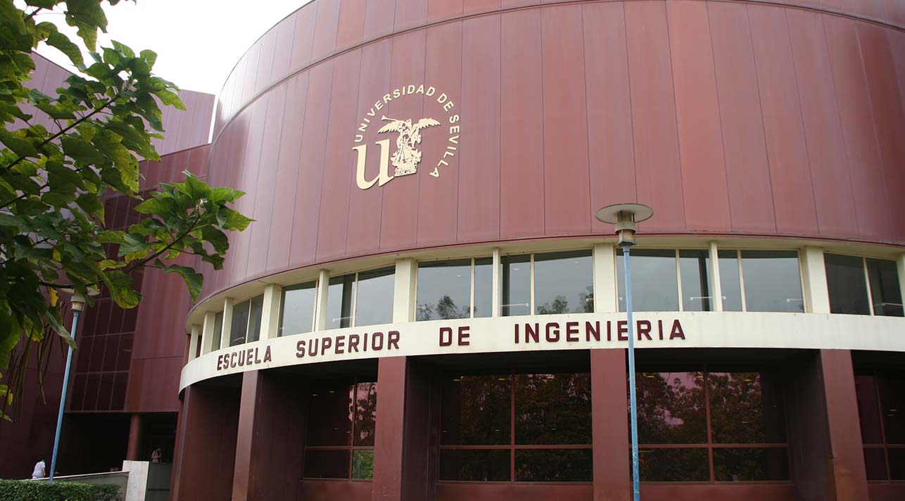
Visita a la Escuela Técnica Superior de Ingeniería de la US
26 de enero de 2023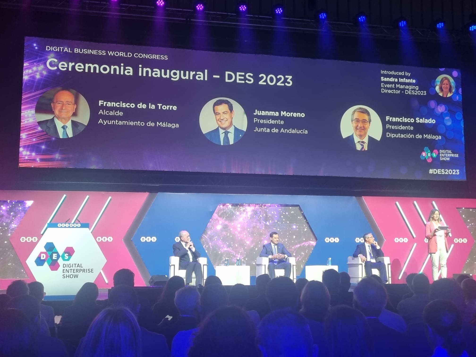
Asistimos al Digital Enterprise Show 2023
13 de junio de 2023
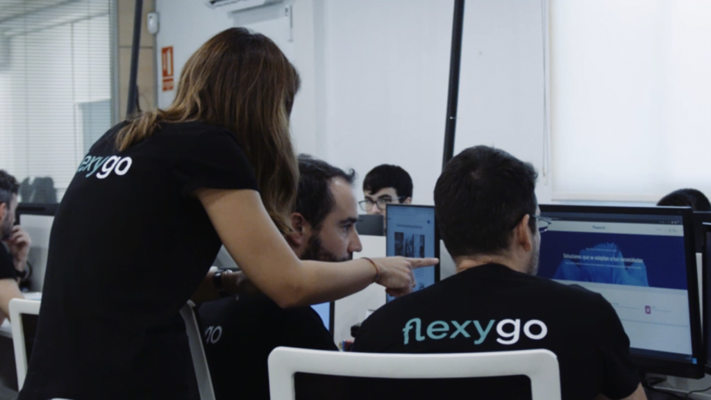
Con motivo de la realización del proyecto de investigación industrial “DF-MAS”, Cenit y Datagram se reunían el miércoles 8 de febrero para continuar con las líneas de actuación marcadas. Ambas empresas colaboran de forma estrecha en la puesta en marcha de la propuesta Digital Fleet Maintenance Services, lo que conlleva una constante comunicación acerca de los procesos establecidos. Este proyecto es una iniciativa financiada por el Ministerio de Industria, Comercio y Turismo dentro del programa de apoyo a las AEI para contribuir a la mejora de la competitividad de la industria española, y con el apoyo de la Unión Europea a través del Plan de Recuperación, Transformación y Resiliencia.
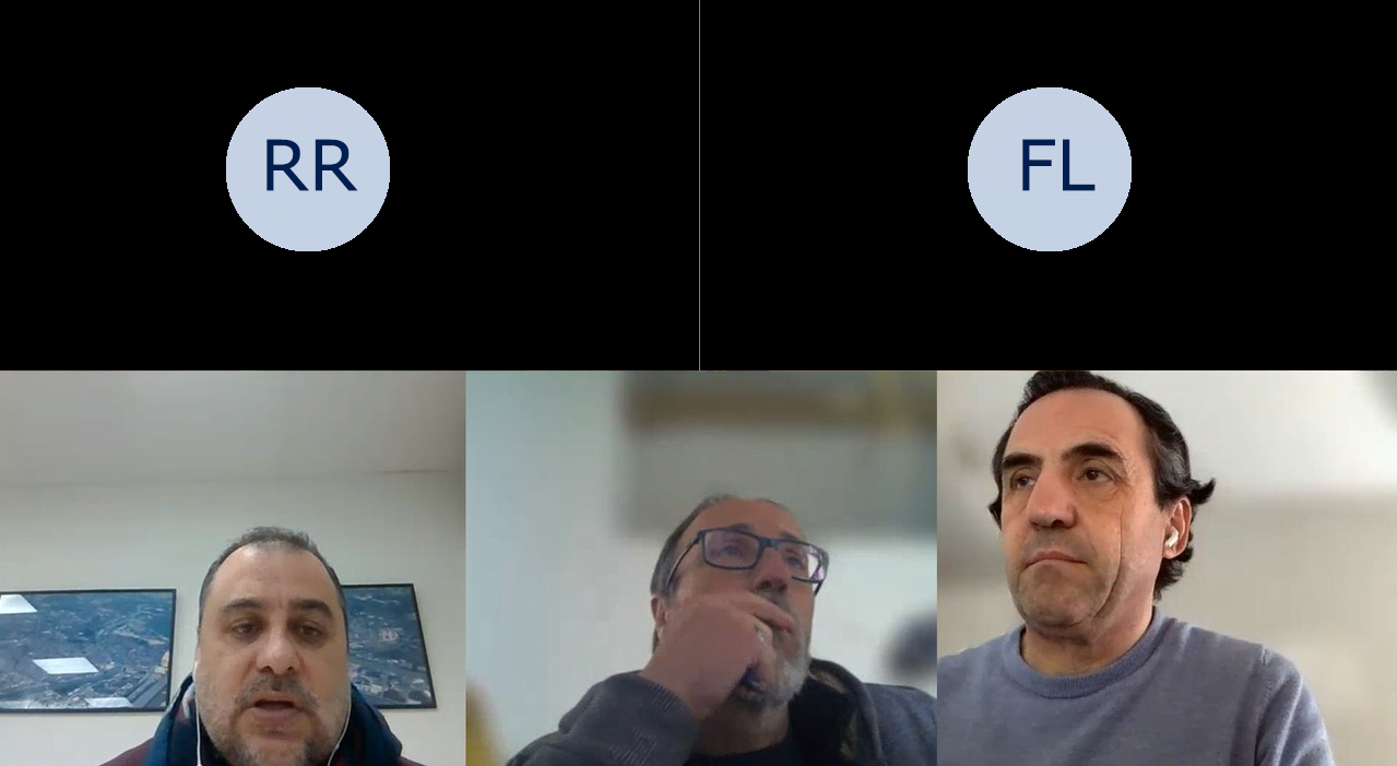
Puesta en común de la estructura de datos
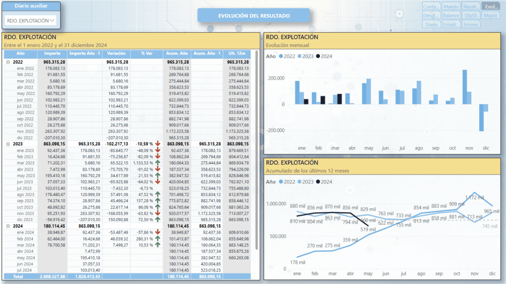
La reunión celebrada el pasado miércoles tenía como objetivo el análisis de la estructura de los datos recogidos en el SmartBus, uno de los elementos clave en las comunicaciones internas del proyecto. Este SmartBus de comunicaciones funcionará con un prototipo diseñado bajo la tecnología Apache Kafka.
Continúan así los procesos de colaboración entre los miembros del consorcio, y se procede a la elaboración del prototipo acordado; un nuevo paso en el diseño del proyecto “DF-MAS”.
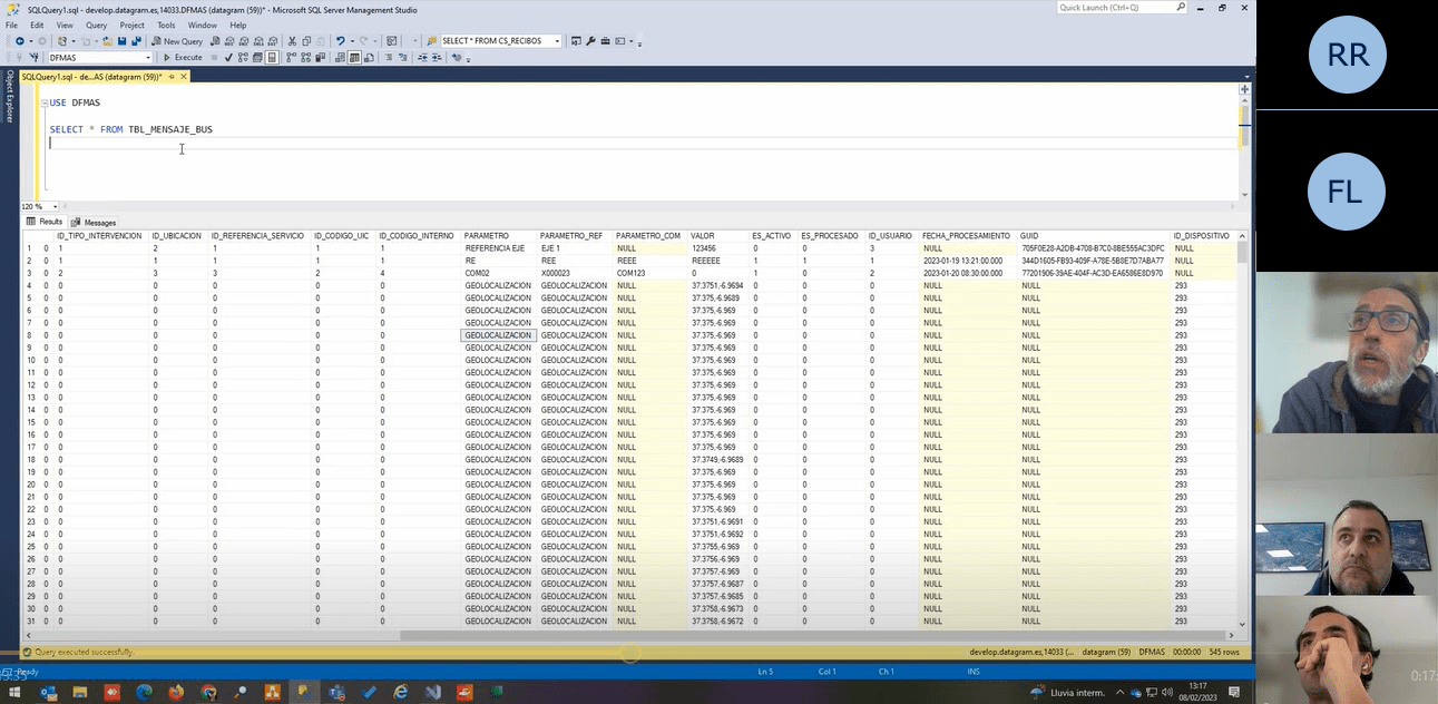
Análisis de la estructura de datos
